Redesigning Chat for Mobile 3D Experience
Product Design - Digital Experience Redesign
Key screens from prototype
Introduction
Redefining the user experience of a virtual 3D platform for better engagement and accessibility
About Pixel Canvas Metaverse
Pixel Canvas specializes in browser-based 3D experiences. The company offers two core products: the Virtual Event Dashboard (B2B) and Visitor Experience (B2C). These products work synergistically, allowing enterprise users to create a branded metaverse experience for their customers. This case study dives into the redesign of the Visitor Experience that includes 3D space exploration, video/text chats, avatar interactions, and livestreams
My Role
Product Designer
Team
Me
2 Software Engineers
1 Unreal Engine Engineer
Timeline
January-June 2023
Skills
UI Design
UX Design
Design System
Design Research
Process

1. Research
User research on the current visitor experience

2. Strategize
Identify issues to resolve

3. Ideation
Design user flows, wireframes, and interactive prototypes

4. Testing
Conduct user tests on the prototypes

5. Iteration
Update the prototype design based on user test results
The Need for Redesign
When Pixel Canvas transitioned from a VR gaming company to a 3D virtual experience startup, the founding designer had to whip up a desktop design prototype of the experience as a quick proof-of-concept and the founding developers turned it into code in a single night. This platform aimed to enable users to log in, engage in chat conversations, enjoy livestreams, and immerse themselves in 3D games. While the concept was promising, it presented considerable complexity and wasn't something that could be developed overnight. Unfortunately, the overall user experience fell short of being mobile-friendly, and certain aspects of the interface were unintuitive to use. These challenges put us at a competitive disadvantage, making it clear that an urgent redesign of the visitor experience was necessary.

Visitor experience on mobile

User’s comment during a public virtual event

Visitor experience on desktop
Research
Where Exactly Needs Improvement?
With the hypothesis that the user experience is unintuitive and mobile unfriendly, I devised a user research plan aimed at identifying visitors' specific pain points. This approach would help me gather insights to guide the overall redesign of the mobile experience.
Research Methods
-
Usability Tests: I administered a list of tasks to see how users interacted with our metaverse
-
User Interviews: I conducted interviews, posing questions that delved into users' thoughts and feelings regarding the product.
-
Post-Interview Surveys: To supplement qualitative findings with quantitative data, I sent out surveys after the user interviews.

Remote user research recording
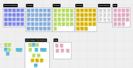
Result analysis on Miro
Key Findings
-
Users are impressed by the quality of the 3D space and the seamless browser-based access to the metaverse, eliminating the need for downloads
-
The mobile experience is hardly usable in its current state
-
A notable portion of users encountered confusion when using the social features, such as getting into a chat, inviting friends to chat, and ending a chat

Excerpt from research report: mobile experience issues
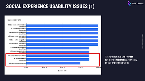
Excerpt from research report: social experience usability issues
Strategize
Identifying and Resolving Issues
Problem
Mobile experience was not usable
The original design lacked responsiveness

On mobile devices, the 2D user interface occupied excessive space, particularly in portrait mode.
Proposed Solution
Optimize the interface for smaller screens
-
Mobile-first design approach
-
Consolidate the buttons on the screen

Button consolidation brainstorm on Miro
Problem
Social features were confusing
The social and 3D experiences seemed disjointed and the interface was unfamiliar to users

3D space/avatar and the social chats are unrelated to one another
Proposed Solution
Improve the social experience UXUI
-
UX: Bridge the gap between social features and 3D interactions to create a more immersive overall experience
-
UI: Use patterns that’s familiar to users

Social experience brainstorm on Miro
Navigating the intricacies of this visitor platform, which included registration, navigation (teleporting), social interactions (video/text chats), livestream, edit profile/avatars was quite the journey. Over 5 months, I revamped the platform's user interface and made significant improvements to navigation and social interactions. In the following case study, I will dive into the details of how I redesigned the social interactions to keep the case study short.
Ideation
From Conceptual to UIUX Design
Brainstorming Ways to Enhance the Chat Experience
In the previous design, user could join a chat via a chat list, an invitation, or a chat widget in 3D that flows above a piece of furniture. However, our user research indicated that when a user joined a chat via a chat list, they had no idea where the other people's avatars were in 3D space. It felt as if the 3D and chat experiences were separate interactions, which hindered immersion. Our team's vision was to create a digital experience that mimicked real-life social interactions, where you can talk to someone nearby.
I brainstormed 3 chat experiences and discussed them with the rest of the product team. In the end, we agreed to move forward with option 2, considering clients who wanted chat rooms tied to specific booths.

Three options for enhancing the chat experience on Miro board.
The most significant departure from the current experience is that all chat rooms will now be linked to a specific 3D location. This change allows users to see the avatars of others in the same chat, enhancing immersion.

Before: users felt disconnect between 3D and chat when they join the chat room via method 2 and 3

After: chat rooms are linked to a specific 3D location so that users need to teleport to the chat room to join

User flow of the chat experience interactions of option 2.

Wireframes of the chat experience on mobile. Click to view the Figma link. (Password: 0927)
Style Exploration of the Mobile Experience
After creating user flows and wireframes for all platform features, the next step was to determine the platform’s visual style. Our user research results revealed that the current style, which occupied too much mobile screen space and featured an overwhelming number of buttons, was not optimal. I set out to find inspirations for a new style that is clean, neutral, and unobtrusive when not in use.

UI Moodboard of inspirations from video games, social media APPs, and competitors.
Subsequently, I crafted three distinct options for the heads-up-display (HUD) screen to set the platform's visual style.


Option 1 features glassmorphic-style small buttons with a mutual white color scheme and transparency to minimize distractions. It draws inspiration from current UI trends and the latest Pixel Connect design.


Option 2 was inspired by video games and competitors. I created transparent dark buttons with thin outlines. The brand color is sparingly used on decorative elements to add character, and the UI can be customized to match any brand's colors


Option 3 was Inspired by flat and minimal design trends. This option closely resembles Pixel Canvas' previous 3D HUD buttons. It uses simple, solid icons with no outlines, and adds dark shadows below the buttons to make them pop from the 3D background.
I presented these style options to the rest of the team and organized a survey for stakeholders to cast their votes. Ultimately, we selected option 2. This choice resonated with a more modern and video game-like aesthetic, offering the opportunity to incorporate client’s brand colors into the UI. From an accessibility perspective, the dark background and white icons provided superior color contrast.
To ensure a well-rounded design, I incorporated valuable elements from other options, such as adding labels to option 2 and adjusting icon weight to enhance readability.
After
Before
After

Mobile-First Approach Using a Design System
Reflecting on lessons learned from previous projects, where mobile design and the implementation of a design system were added as afterthoughts, I adopted a mobile-first and design-system-first approach. This involved prioritizing the design of mobile features before their desktop counterparts and concurrently developing the design system and mockups. This strategy aimed to ensure mobile-friendliness, maintain visual consistency, and enhance scalability from the beginning.
Creating a design system was the most challenging part thus far because this was the first time I designed an entire product with Figma, transitioning away from Adobe XD. I had to rapidly familiarize myself with Figma’s tools and workflows. In past projects, when the lead designer completed style setup, the design team would divide and conquer tasks. However, as a design team of one on this project, the workload became more demanding.
Leveraging Carbon Design System for Efficiency
To expedite this process, I leveraged the Carbon Design System's Figma UI kit, customizing it to align with the style I designed. I selected Carbon Design System because it struck a balance between flexibility and detail, eliminating the need to “reinvent the wheel.” This decision accelerated the progress and allowed me to defined the colors and typography in just 2 days.

Turning Carbon Design System into one we can use for the visitor experience.
Chat Window Design Options
After finalizing the HUD button design and establishing the design system, I proceeded to design 2 options for the chat window. The primary distinction between the two is the placement of the chat controls.
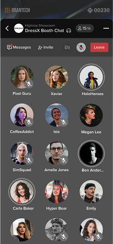

Option 1
Pros: text input field doesn’t interfere with the chat control buttons.
Cons: control bar takes up space from text chat display


Option 2
Pros: the control buttons look cleaner.
Cons: control bar and text input bar can be confusing being put together. not sure if we can do hiding the control bar while in input mode
Following thorough discussions with the development team, I made the decision to move forward with option 1. This choice was motivated by option 1’s smoother transition into typing mode.
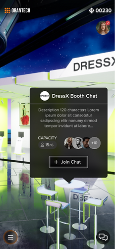


Key screens of the chat experience hi-fi prototype
Testing
How Well Does the New Solution Work?
I designed high-fidelity prototypes for the maps and chats features to replicate the real metaverse experience, and organized usability tests using these prototypes. While it was important to test for all features, I gave priority to validating the maps and chats features. This was because they had a more complex interactions and represented a significant departure from previous designs compared to the other features.
Regarding the social features, I wanted to determine whether the new design improved the call experience in terms of joining and ending calls, as well as inviting guests.
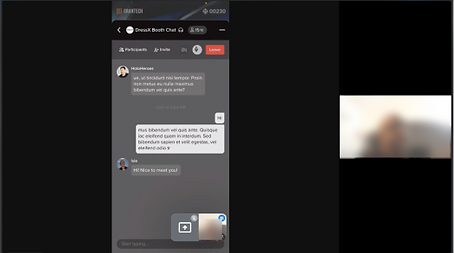
Remote user interview session

Interactive hi-fi prototype in Figma for testing
Key Findings on Chat UX
Positive Feedback: Throughout the tests, users were able to complete the tasks
Negative Feedback: Users found the chat interface overwhelming, with comments like "too much is happening."
Before
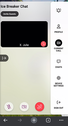
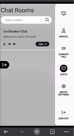
To avoid users clicking onto a “Current Call” tab when there’s no call, I consolidated “Current Call” and “Chats.”
After


In the new design, users can tap on the “Back” arrow to access a list of chat rooms while being in a call. However, during the test users got overwhelmed by navigating to the different lists during the call.
Iteration
Redesigning the “Current Call” Tab
When I designed the chat experience, I drew inspiration from Facebook Messenger because most people are familiar with the product. In Messenger, users can easily switch to different text chats while on a call. However, when incorporating this into our 3D-based digital experience, user test result above shows that they get overwhelmed by seeing irrelevant chats while being in a call. Maybe I should add the “current call,” tab back in, so it’s separated from the rest of the chat?

In the current design, having the minimized ongoing call nested within the “Chat Room” list overwhelms users.
In the previous metaverse design, when a user was in a call, “current call” tab would open up. The issue with this design was that users sometimes clicked on the same tab when they were not in a call, only to find it un-clickable. How can I redesign the “current call” tab so that it wouldn’t distract users when not in use?

In the previous design, the “Current Call” button was always present but not always clickable, which confused users
Designing a Chat Experience for Immersive Digital Experience
Drawing inspirations from Apple’s dynamic island UI, which presents only the relevant content, I iterated on my design. In this design, when the user is in a call, the UI displays only the current call. If the user wants to navigate the 3D environment while in a call, the call is minimized into a pill-shaped button. This ensures that the current call UI only appears when the user is actively in one — not distracting when not in a call, and preventing it from getting mixed with other text chats. I then discussed the new design with software developers to ensure its technical feasibility.
I validated this new design with users and sought design critiques from senior designers, both of which showed positive results.
Finally, I wrapped up the project and provided developers with the designs, detailed handoff notes, and the design system UI kit.

“Dynamic Island” from Apple

“Current Call” pill-shaped button that only appears when the user is in a call and minimized the call window
Final Designs
Finally, I wrapped up the project and provided developers with the designs, detailed handoff notes, and the design system UI kit.
Finalized Chat Experience Design on Mobile
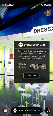
Minimized current chat button

Chat participants
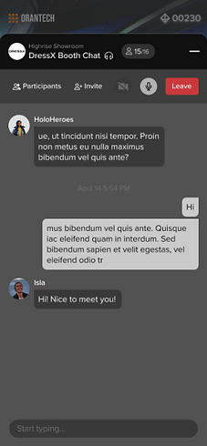
Text messages during live chat

Text message list
Finalized Chat Experience Design on Desktop

“Current Call” on desktop that maximizes the screen space for 3D interaction during calls

“Chat Room List” on desktop with current chat minimized
Documentations

Design system UI kit on Figma

Handoff notes for developers
Conclusion
Key Insights from Redesigning as a Solo Designer
The previous design had been battle tested as a virtual events solution, yet it was in many ways unsuited for the new metaverse platform. In the redesign, I followed the user-center design practice and crafted intuitive 2D interactions that compliments the 3D immersive experience. Most importantly, this new design is responsive and looks comparable to competitors’ products.
I had planned to conduct more user research after its implementation to find out the overall usability and impression of the visitor experience, then eventually setup real-time data tracking when it’s put into use. Unfortunately, just when the redesign is implemented, I was furloughed along with the rest of the product team because the company was heavily impacted by the crypto crash.
Nevertheless, I learned these lessons while working on this incredible project:
Designing Familiar Experience
Taking familiar ux patterns and publicly available design systems helps users onboard faster and helps me speedup the design process. However, more testing will be needed to see if the patterns and design system suits the context of the specific experience I am designing for.
Break Down a Complex Experience into Bite-Sized Features
Since the team did not have a product manager, the role needed to be share among members of the product team. I greatly underestimated the time it needed in the design phase because I found more issues to get resolved than expected through the user research process. Luckily, from the beginning of the design phrase, I broke down the visitor experience into 7 different features. This helped me and the rest of the product team readjust the timeline and not get overwhelmed by the scale of the project.
Proactively Ask for Feedback with Cross-functional Partners
What I did this time that’s different from how I designed previously is that I asked for feedback early in the design process. I would leave questions on user flows and wireframes to go over with the engineers to make sure the design is technically sound. In these frequent exchanges, we were able to spot issues early and get engineers familiar with the design. This improved the handoff process by avoiding design-development mismatches and reducing the time it would take to explain the design.